

Introduction
Turning a query into a chart usually means a notebook, a plotting library, or pasting numbers into a spreadsheet. This post skips all of that: you'll pipe a SQL result straight into aux4/chart and get a finished PNG — bar, grouped bar, line, and pie — rendered entirely offline, no browser or Chrome involved.
Install the packages
aux4 aux4 pkger install aux4/db-sqlite aux4/chart aux4/2table
Step 1: some data to chart
Create a tiny sales table — six months of revenue and cost across two products:
aux4 db sqlite execute --database sales.db \
  --query "CREATE TABLE sales (month TEXT, product TEXT, revenue INTEGER, cost INTEGER)"

aux4 db sqlite execute --database sales.db \
  --query "INSERT INTO sales (month, product, revenue, cost) VALUES
    ('Jan','Widget',12000,8000),('Jan','Gadget',9000,6000),
    ('Feb','Widget',15000,9000),('Feb','Gadget',11000,7000),
    ('Mar','Widget',18000,11000),('Mar','Gadget',13000,8000),
    ('Apr','Widget',17000,10000),('Apr','Gadget',15000,9000),
    ('May','Widget',21000,12000),('May','Gadget',16000,9500),
    ('Jun','Widget',24000,13000),('Jun','Gadget',19000,11000)"
A write returns an empty array — that's success:
[]
Step 2: query it as JSON, and as a table
aux4 db sqlite execute returns rows as a JSON array. SQLite has no idea Jan comes before Feb, so an explicit CASE orders the months:
aux4 db sqlite execute --database sales.db --query \
  "SELECT month, SUM(revenue) AS revenue, SUM(cost) AS cost FROM sales
   GROUP BY month
   ORDER BY CASE month WHEN 'Jan' THEN 1 WHEN 'Feb' THEN 2 WHEN 'Mar' THEN 3
                       WHEN 'Apr' THEN 4 WHEN 'May' THEN 5 WHEN 'Jun' THEN 6 END"
[
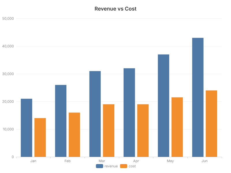
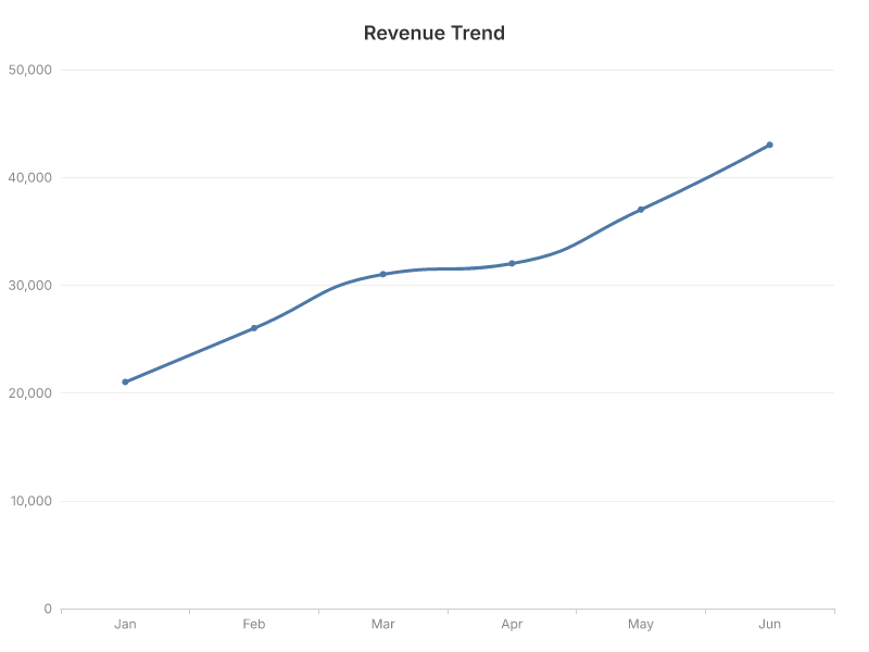
  { "month": "Jan", "revenue": 21000, "cost": 14000 },
  { "month": "Feb", "revenue": 26000, "cost": 16000 },
  { "month": "Mar", "revenue": 31000, "cost": 19000 },
  { "month": "Apr", "revenue": 32000, "cost": 19000 },
  { "month": "May", "revenue": 37000, "cost": 21500 },
  { "month": "Jun", "revenue": 43000, "cost": 24000 }
]
Pipe the same rows into aux4 2table for a quick text view:
... | aux4 2table month,revenue,cost
 month  revenue   cost
 Jan      21000  14000
 Feb      26000  16000
 Mar      31000  19000
 Apr      32000  19000
 May      37000  21500
 Jun      43000  24000
That JSON array is exactly what aux4 chart reads on stdin.
Step 3: pipe the rows into a bar chart
Swap 2table for aux4 chart bar. --x is the category axis, --y the value column, --output the file to write:
aux4 db sqlite execute --database sales.db --query \
  "SELECT month, SUM(revenue) AS revenue FROM sales GROUP BY month
   ORDER BY CASE month WHEN 'Jan' THEN 1 WHEN 'Feb' THEN 2 WHEN 'Mar' THEN 3
                       WHEN 'Apr' THEN 4 WHEN 'May' THEN 5 WHEN 'Jun' THEN 6 END" \
  | aux4 chart bar --x month --y revenue --title "Revenue by Month" --output revenue-by-month.png
Saved PNG chart to revenue-by-month.png (800x600)
That's the whole idea — SQL on the left of the pipe, an 800×600 PNG on the right.
Step 4: two series at once
Pass two columns to --y and you get grouped bars — revenue against cost, side by side each month:
... --query "SELECT month, SUM(revenue) AS revenue, SUM(cost) AS cost FROM sales GROUP BY month ORDER BY ..." \
  | aux4 chart bar --x month --y revenue,cost --title "Revenue vs Cost" --output revenue-vs-cost.png
When the series live in a column instead of separate fields, pivot with --series. Here each row is one product-month, and --series product turns the product column into grouped bars:
aux4 db sqlite execute --database sales.db --query \
  "SELECT month, product, revenue FROM sales
   ORDER BY CASE month WHEN 'Jan' THEN 1 WHEN 'Feb' THEN 2 WHEN 'Mar' THEN 3
                       WHEN 'Apr' THEN 4 WHEN 'May' THEN 5 WHEN 'Jun' THEN 6 END, product" \
  | aux4 chart bar --x month --series product --y revenue --title "Revenue by Product" --output revenue-by-product.png
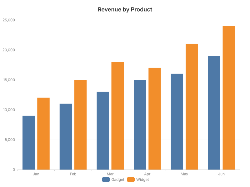
--y a,b for wide columns, --series col for a tidy column — two ways to reach the same grouped chart.
Step 5: other chart types, same pipe
The subcommand is the only thing that changes. A line chart for the trend:
... | aux4 chart line --x month --y revenue --title "Revenue Trend" --output revenue-trend.png
A pie for each product's share of total revenue — --x is the slice label, --y the size:
aux4 db sqlite execute --database sales.db --query \
  "SELECT product, SUM(revenue) AS revenue FROM sales GROUP BY product" \
  | aux4 chart pie --x product --y revenue --title "Revenue Share by Product" --output revenue-share.png
Saved PNG chart to revenue-share.png (800x600)
bar, line, area, pie, doughnut, scatter, and radar all read the same JSON shape.
Step 6: SVG to stdout
Skip the file entirely and stream SVG — use --output=- (with the =) and --format svg:
... | aux4 chart pie --x product --y revenue --output=- --format svg | head -c 200
<svg width="800" height="600" xmlns="http://www.w3.org/2000/svg" xmlns:xlink="http://www.w3.org/1999/xlink" version="1.1" baseProfile="full" viewBox="0 0 800 600">
That makes the chart a value in a larger pipeline — embed it in an HTML report, or hand it to another tool, without ever touching disk.
Conclusion
You went from a SQL query to bar, grouped, line, and pie charts with a single pipe and no plotting stack — aux4/db-sqlite produces the rows, aux4/chart renders the image, all offline. Any command that emits a JSON array of records — a database, a REST API, a CSV loader — can feed the exact same chart pipeline.